Custom Buttons Not Using Dark Theme Styles

WebViewer Version: 8.8.0

Do you have an issue with a specific file(s)? No
Can you reproduce using one of our samples or online demos? N/A
Are you using the WebViewer server? No
Does the issue only happen on certain browsers? No
Is your issue related to a front-end framework? Yes
Is your issue related to annotations? No

Please give a brief summary of your issue:
Custom Buttons Not Using Dark Theme Styles

Please describe your issue and provide steps to reproduce it:

I am attempting to create custom buttons for the Annotation toolbar group

            const renderCustomBtn = () => {
                const viewCustomBtn = document.createElement('button');
                viewCustomBtn.appendChild(document.createTextNode("Show Original"));
                viewCustomBtn.onclick = () => {
                    // ToDo
                }
                return viewCustomBtn
            }
            header.getHeader('toolbarGroup-Annotate').unshift({
                type: "customElement",
                render: renderCustomBtn
            })

This rendered button looks great in the default “light” mode, but when “dark” mode is enabled, the button appears to keep some of the “light” mode styling so the button appears as a grey button with white text and it’s almost unreadable.

Is there a setting I am missing or do I need to apply the dark mode classes in an explicit way?

Thank you.
Hi Luke,

For the styles to change between dark mode and light mode, you will have to specify the styles explicitly.
Here is an event you can listen for to update your custom styles: themeChanged

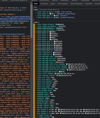
To use the same styles that we have in WebViewer, you can use our CSS variables that change style based on the theme. Here is an example:

const { UI, Core } = instance;
UI.setHeaderItems(header => {
  const renderCustomBtn = () => {
    const viewCustomBtn = document.createElement('button');
    viewCustomBtn.appendChild(document.createTextNode("Show Original"));
    viewCustomBtn.style.cssText = `
      border-radius: 4px;
      border: 1px solid var(--primary-button);
      color: var(--ribbon-active-color);
  `
    viewCustomBtn.onclick = () => {
      // ToDo
    }
    return viewCustomBtn
  }
  header.getHeader('toolbarGroup-Annotate').unshift({
    type: "customElement",
    render: renderCustomBtn
  })
})

You can find the list of CSS variable we have defined by inspecting a WebViewer element and scrolling close to the bottom on the styles tab of the browser.

Best Regards,
Ahmad Moaaz
Software Developer
PDFTron Systems, Inc.
www.pdftron.com

Makes sense. Thank you for clearing this up for me. Appreciate it!