Want to make custom button behavior same as built-in button

WebViewer Version: 11.7.1

Do you have an issue with a specific file(s)? No
Can you reproduce using one of our samples or online demos? No
Are you using the WebViewer server? Yes
Does the issue only happen on certain browsers? No
Is your issue related to a front-end framework? No
Is your issue related to annotations? No

Please give a brief summary of your issue:
Want to make custom button behavior same as built-in button

Please describe your issue and provide steps to reproduce it:
I have added new custom button, on selecting that button is not behaving the same as built-in button.

const waterMarkButton = new instance.UI.Components.CustomButton({
    dataElement: 'WaterMarkButton',
    title: 'WaterMark',
    img: `<svg viewBox="0 0 512 512" xmlns="http://www.w3.org/2000/svg">
              <path d="M96 32h240l80 80v368H96z" fill="#f7f3f2"/>
              <path d="M336 32v80h80z" fill="#e0ddef"/>
              <path d="M256 170 L190 360 H220 L238 310 H274 L292 360 H322 L256 170 Z M246 285 L256 250 L266 285 Z" fill="#000"/>
              <rect x="140" y="140" width="90" height="14" rx="7" fill="#000"/>
              <rect x="140" y="190" width="75" height="14" rx="7" fill="#000"/>
              <rect x="140" y="240" width="70" height="14" rx="7" fill="#000"/>
              <rect x="140" y="290" width="60" height="14" rx="7" fill="#000"/>
              <rect x="290" y="140" width="90" height="14" rx="7" fill="#000"/>
              <rect x="300" y="190" width="75" height="14" rx="7" fill="#000"/>
              <rect x="304" y="240" width="70" height="14" rx="7" fill="#000"/>
              <rect x="310" y="290" width="60" height="14" rx="7" fill="#000"/>
              <rect x="140" y="390" width="240" height="16" rx="8" fill="#000"/>
          </svg>`,
    onClick: () => {
        instance.UI.openElements(['waterMarkPanel']);
        instance.UI.setActiveLeftPanel('waterMarkPanel');
    }
});
let insertGroupedItems = toolHeader
    .getItems('groupedItems')
    .find((data) => data.dataElement === 'insertGroupedItems');
let annotateToolGrpItem = insertGroupedItems.items.find(
    (data) => data.dataElement === 'insertToolsGroupedItems'
);
annotateToolGrpItem.items.splice(4, 0, waterMarkButton);
toolHeader.setItems([...toolHeader.getItems()]);```


In Apryse WebViewer, toolbar buttons (such as **Note**, **Highlight**, **Strikeout**, etc.) automatically show a **selected/active state** when clicked.
This is because Apryse internally manages the UI state for all *built-in annotation tools*.

However, the **custom watermark button** (or any other custom button you added) does **NOT** show the selected/active styling.
When the user clicks on it:

* The button does not highlight

* No active border or background appears

* The button does not behave like other built-in annotation buttons

This creates inconsistent UX because all native annotation buttons visually indicate selection, but the custom button does not.


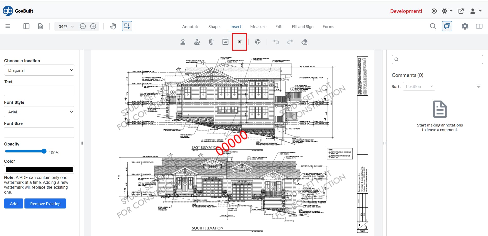
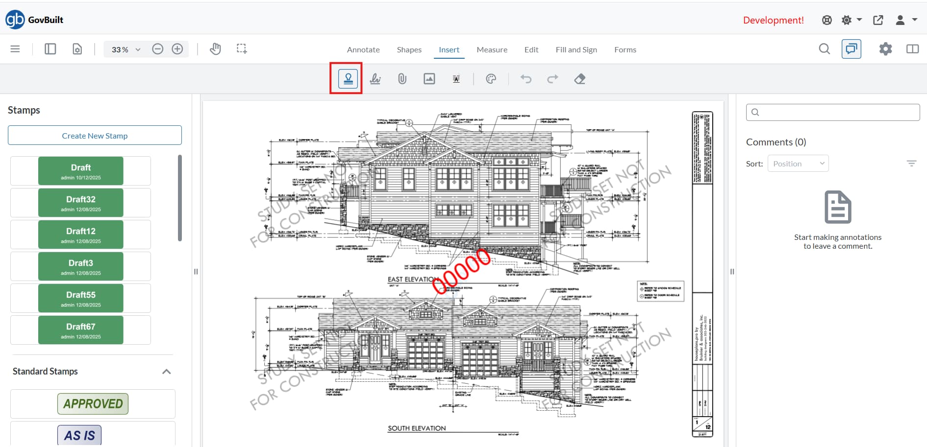
When user click on the custom watermark button, there is not active effect.
![image|690x334](upload://bZcccuEveUpziGTfBWp695LXkMv.jpeg)

But when user click on the stamp button there is active effect visible.
![Stamp_Button_Active|690x333](upload://lvf9B4ZP9JC9U6KFLUkEv1gFBP6.jpeg)

Please provide a link to a minimal sample where the issue is reproducible:
1 Like

Hello, I’m AiRon, an automated tech support bot :robot:
While you wait for one of our customer support representatives, I can help you with your question.


It seems like you’re trying to create a custom button in WebViewer that behaves similarly to a built-in button. Your code snippet indicates that you’re adding a new custom button to a toolbar, but it might not be functioning as expected. Here are some steps to ensure your button behaves like a built-in button.


Some things you can try:

  • Ensure that the SVG for the button icon is correctly formatted and rendered. Double-check the SVG syntax and ensure it’s valid.

  • Verify that the onClick function correctly references existing UI elements. The function should use instance.UI methods to open and set panels as intended.

  • Make sure the panel you are trying to open (waterMarkPanel) is correctly defined and accessible in your WebViewer instance.

  • Check that the button is correctly inserted into the toolbar by examining the toolbar’s structure after insertion.


Here are some resources that might help you:


Hopefully, this helps you solve your problem while you wait for a human to get back to you.


1 Like

Hello @rishumishra2001,

Thank you for posting on our forum,

For context, we provide different button classes to help fit multiple types of workflows. The CustomButton class is one of our most versatile, but it also doesn’t behave exactly the same as many of our Preset components, such as the “Stamp Tool” button that is highlighted in your second screenshot.

Based on the code onClick function of the code provided, if I understand correctly, you would like a button that would toggle between an “active” state which would display the watermarkPanel and a “inactive” state which would hide the watermarkPanel? Let me know if I misunderstood your desired workflow.

In this type of workflow, we would recommend using a “Toggle Element” button. This is used to hide/show certain elements such as panels, and will display the “Active” state you are looking for while the panel is open.

Here is an example:

You can find our guide for implementing “Toggle element” buttons here: https://docs.apryse.com/web/guides/modular-ui/items#toggle-element-buttons

You can also find the code snippet I used for our custom panel here, which also includes a snippet for a toggleElement button: https://docs.apryse.com/web/guides/modular-ui/panels#adding-custom-panels

Let us know if this works for you!

Best Regards,
Jacob Romano Carlsen
Web Development Support Engineer
Apryse Software Inc.

1 Like